Whether you need end-to-end product development support or the engineering know-how for a targeted project, we can help. Book a free consult to learn more.
DockYard partnered with a post-secondary school readiness platform for over a year, providing Elixir services to enhance their product. Post-launch, however, the platform struggled to retain long-term paid customers.
To solve that problem, our team executed a design sprint and proposed a user-centric path forward. We delivered strategic user research to both offer insights into what it would take to grow a paid user base, and fuel an interactive product vision that focused on small, impactful changes over complete product overhauls.
From those findings, we discovered that the platform possessed a unique value for its user base, but that value needed to be amplified to reach a broader audience.
The Challenge
The platform helps teenagers and young adults navigate the transitional period after high school. It offers comprehensive career pathways, college preparation tools, and other educational resources to support young adults in defining their life paths.
To innovate its current offerings, the company identified three principles it believed would elevate a new paid offering:
- Mobile-specific interfaces for teenagers.
- Gamification to motivate continued learning.
- AI-generated, user-connected content.
We guided our work with a research statement:
“We believe that high school students face a confusing and overwhelming choice when deciding on their post-high-school pathway. We think a post-secondary school readiness platform can solve this. We’ll know we’re right if we see students complete a project within the first seven days of signing up as the activation point.”
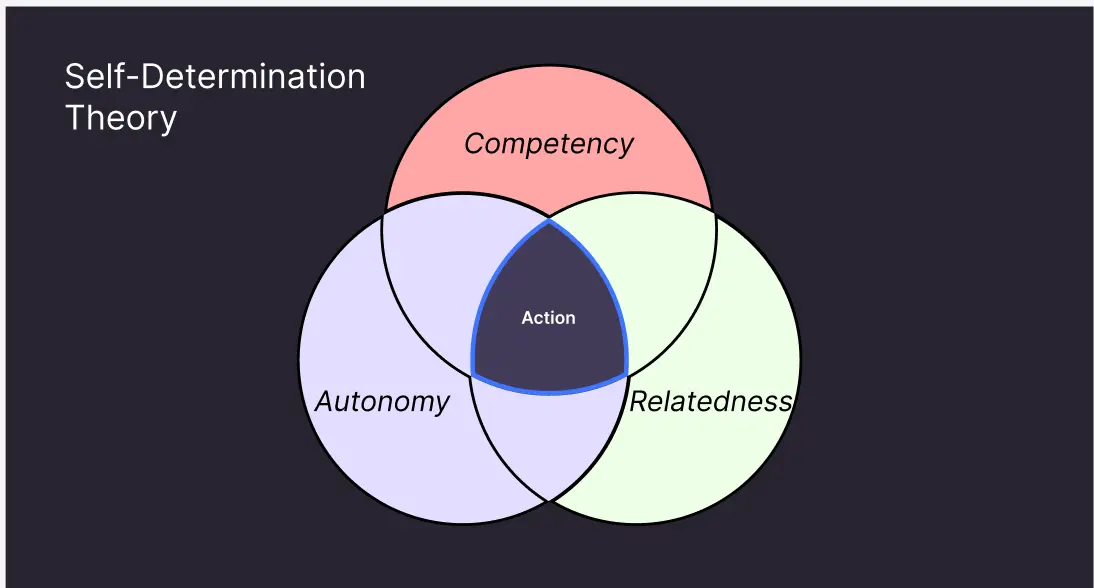
We centered our strategy sprint on the self-determination theory of human psychology, which emphasizes three innate desires: competency, autonomy, and relatedness.
Competency: Quick tasks to build a sense of success for students.
Autonomy: Allowing students to set goals and add their own due dates for accountability.
Relatedness: Connecting students with trending topics and experiences of others who have been through similar paths

Our Process: Discovery
We began our discovery phase with two main approaches: a product audit to identify common UX pain points and research workshops with existing users.
From the UX audit, we discovered that the onboarding and login flows were key areas for improvement. Form field validation and input defaults often led users down a path of uncertainty. Uninformative error states and restrictive input options made the onboarding process inaccessible, deterring potential users. Users confirmed our hypothesis about the painful onboarding process during direct interviews.
User interviews also highlighted what the product did right. Users appreciated the content available on the post-secondary platform and found it crucial to their successful transition into adulthood.
However, that positive feedback was largely contained to a group of users who navigated the platform with the help of a sponsored program that came with an organized syllabus. Once they needed to use the platform independently, they felt lost. That indicated a need for more structured teachings to welcome a wide range of new users without losing them due to confusing onboarding flows.
Interviewees also expressed a desire for personalization, which was partially addressed during the existing onboarding flow. We saw value in enhancing this flow to personalize content and directives based on the user’s specific goals.
Outline: The User
Our user personas were young adults aged 16-24. During this transitional period, they share essential needs but have unique end goals. Some aim to transition into higher education, others seek direct career paths, and some require a combination of both. This dynamic need for navigation pointed to the value of personalized learning.
Delivery: The Wireframes
Onboarding & Login
Our focus on onboarding was twofold: securing an account’s login credentials and capturing optional information to personalize the content experience. Prioritizing account creation secured leads, allowing users to resume the onboarding process independently or through future outreach.
Our proposed design reduced barriers to entry by enabling cached user information with a “remember me” option. We also addressed form field pain points by delaying error messages until users had sufficient time to complete their input. Error states on page submission now guide users to specific issues, preventing frustration.
Homepage Wireframes
Our design also introduced a feature hierarchy to the homepage. Users would be able to access tools like a college finder and content search, followed by educational content displayed as cards that were redesigned to meet user expectations. Goals, a new feature, provided onboarding directions and evolved into self-set directives tailored to each user’s unique goals. Students could choose their own path depending on their outcomes, whether that was getting into college, exploring a trade school, or learning life skills like budgeting. These directives are content modules that users can explore and engage as they move through their designated learning path.
User Personalization and Feedback
While gamification was a client assumption, it was not identified as a missed value in our interviews. Instead of implementing complex gamification features, we proposed rewarding feedback for task completion and small animated elements. This approach would allow us to validate the impact of these additions before investing in more extensive implementations.
Projection: The Future
In order to ensure that development time is spent on features that will address user needs, our proposed strategy involved introducing feature concepts through small-scale implementation to validate their effectiveness.
Products risk failure by taking on significant new directions that take too long to build and divert them from their successful foundations. By proposing incremental steps, we aimed to ensure our efforts align with user needs and maintain the product’s core strengths.
By applying these strategic insights and iterative improvements, DockYard aimed to help a partner not only retain users but also expand its reach to a broader audience, fulfilling its mission to guide young adults through their critical life transitions.


