Kamana
How DockYard doubled Kamana’s user base and annual recurring revenue.
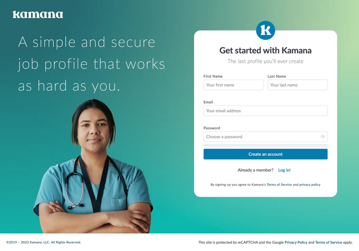
Kamana started when one of the company’s founders identified a specific pain point during his nursing career: Healthcare staffing was repetitive and inefficient, leading to wasted money and missed opportunities for healthcare facilities and workers alike.
Kamana’s solution is twofold:
- A digital wallet for healthcare professionals—such as travel nurses—to store their credentials and seamlessly move between jobs at various healthcare facilities.
- A platform for healthcare staffing agencies to easily find, qualify, and place healthcare professionals.
At the company’s launch, Kamana led the industry in using technology to facilitate healthcare staffing. As other venture capital-backed companies entered the space, however, Kamana found itself in need of a product revamp to keep pace.
Over a 17-month partnership with DockYard, Kamana more than doubled its user base and revenue. The company’s internal processes went from highly individualized to a fully scalable and repeatable development process that allows the team to plan and manage product delivery internally.
"During DockYard's time at Kamana we not only successfully developed, deployed, and implemented a product that addressed complex business processes for our $1B+ parent org, but doubled our user base and ARR (annual recurring revenue). Without DockYard this would not have been possible."
The challenge
Kamana needed to accelerate development and scale its digital wallet for healthcare professionals and facilities. With a rapidly growing user base and a new brand identity rolling out, Kamana’s team needed a partner that could ramp up development and deliver a robust, scalable product to its user base.
Initially, Kamana faced two main short-term challenges:
- A deep digital backlog
- A lack of fingers-on-keys to launch a new professional validation feature
Long-term goals included establishing internal processes to improve development and preparing the application to scale effectively, all while building an internal team from 13 to upward of 50.
During the course of our work, DockYard uncovered another challenge to tackle: Kamana lacked thorough internal design systems to effectively and efficiently scale its application.
Engineers were often tasked with building back-end, front-end, and ad hoc requests without a common language, look, and feel to individual components. The results were often jarring for users and resulted in a cluttered, disjointed interface.
A simple application page might have three different calls to action, four different font-weights, multiple toast messages, and form inputs that weren’t optimized for mobile. With the knowledge that its user base was made up of busy healthcare professionals with little time or patience for poor design and UX, Kamana recognized that its users deserved better.
In addition, a lack of design documentation created inconsistent flows and patterns across the application. Kamana was working off of multiple ad hoc implementations and siloed design systems that were quickly abandoned with new additions.
While Kamana had managed to remain a step ahead of the general healthcare industry UX, its application lagged behind the standards of the broader technology market. Without dedicated developers focused on UXD processes, a deep understanding of Tailwind conventions, best practices for accessibility, or collaboration with Elixir engineers to capitalize on LiveView capabilities, they were losing the battle to delight and engage customers.
The solution
01 Engineering Success
To address Kamana’s core issues, DockYard took a full-team approach to ensure that the final application was entirely cohesive and primed for seamless, scalable growth. This meant that Kamana benefited from the full spectrum of DockYard services: Engineering (including QA), User Experience Development, Design, and Client Partnership.
DockYard’s Engineering team conducted a full architectural review, identifying key failure points for Kamana’s users. We found slow load times that severely impacted a user’s ability to complete their workflow in the app, and charted a course that could dramatically improve load times and give the Kamana team the ability to analyze performance issues with the Flame On library.
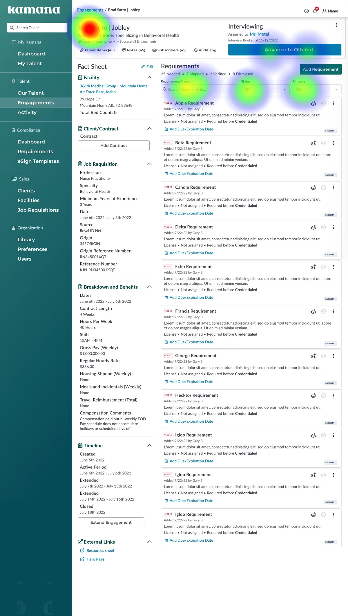
Kamana’s team gained the ability to better and more quickly identify pain points in the app, thanks to monitoring and visibility improvements implemented by the DockYard Engineering team.
From there, our engineers worked in lockstep with the Kamana team to build out features to enable users to efficiently post positions, qualify candidates, and get “feet on the floors” in healthcare facilities that needed staff to meet patient needs.
Those features helped make the transition and onboarding of its parent company, Triage Staffing, a success. Our team also helped Kamana develop a new facet to the product to serve a new user base: healthcare facilities looking for a way to manage their workforce.
02 Design with Impact
On the design front, Kamana received a full design system that bridged the gap between its previous branding and a new brand identity. To start, the DockYard Design team conducted a full product audit and created a sitemap for Kamana.
The audit saved Kamana months of work by identifying failure points in its design, and additional months of rework to build a fully cohesive design system to use across every facet of the Kamana app.
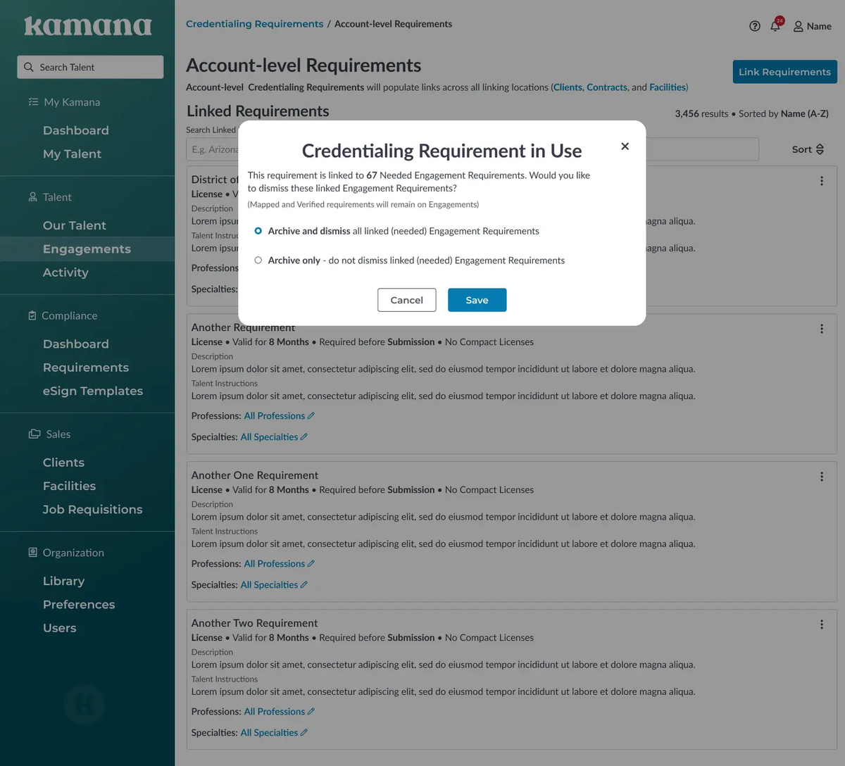
The Kamana application had different outward-facing designs for various user groups. To address the lack of consistency, DockYard’s team created a comprehensive design system that provided Kamana with the artifacts needed to continue iterating on a cohesive design across the app, regardless of the app’s future state or features.
To amplify the value of the new design system, our UXD team also built out a Tailwind Component Library to give Kamana the tools they needed to quickly and efficiently continue development internally while maintaining brand cohesion and consistency.
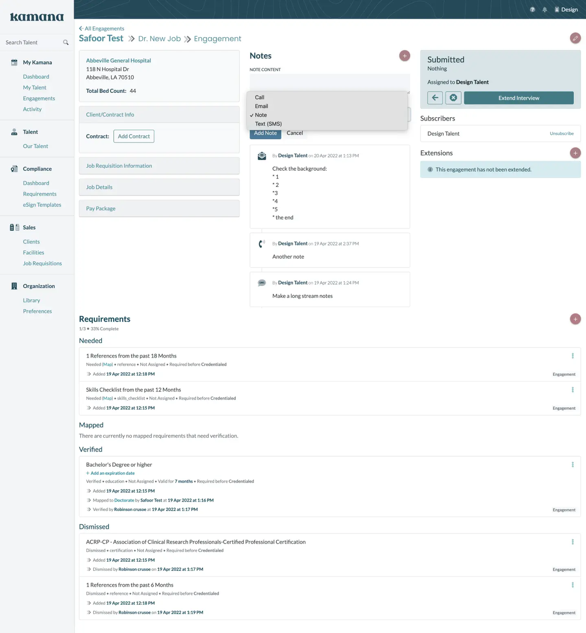
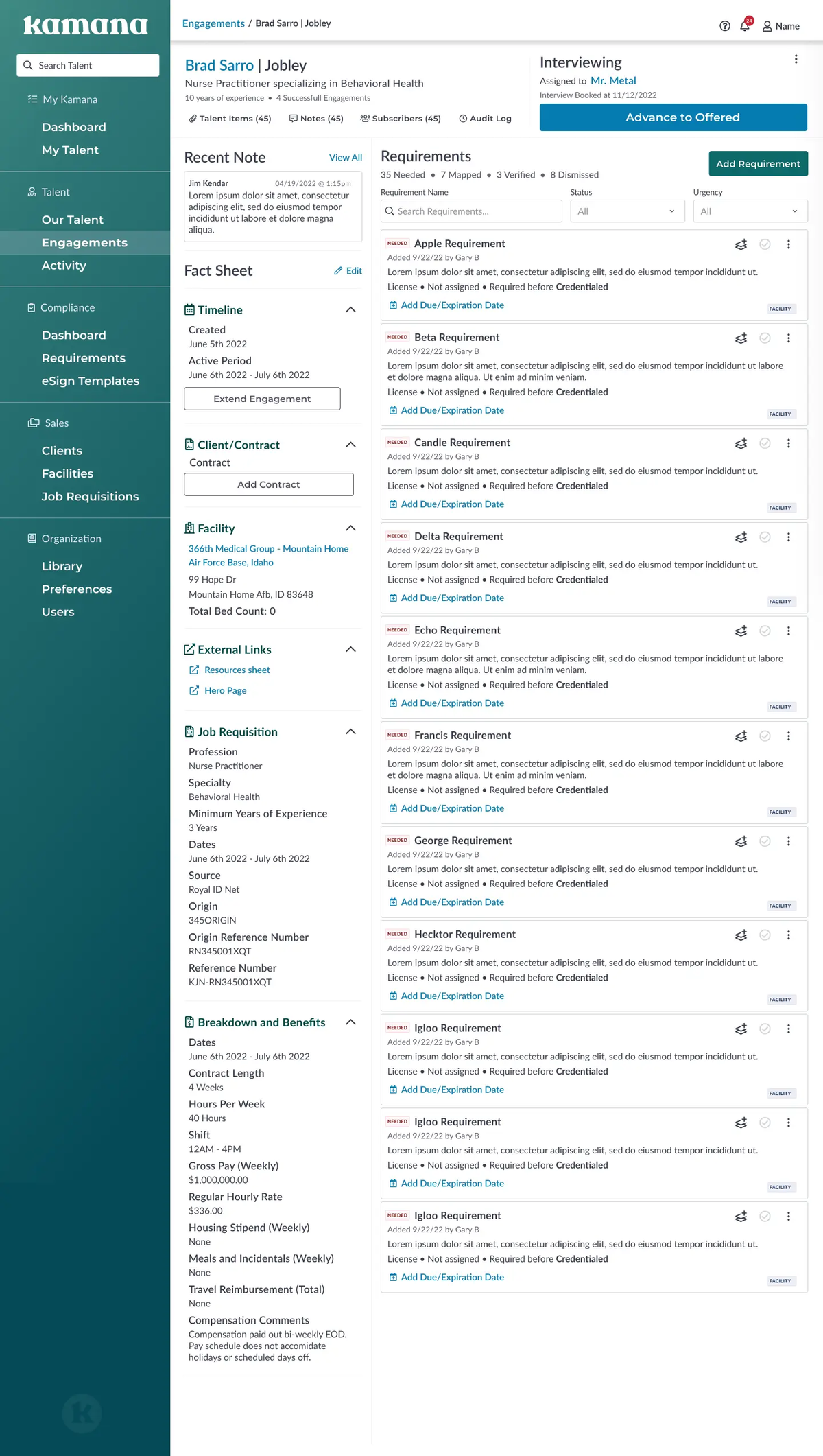
Thanks to the design system’s use of Tailwind naming convention for components, Kamana gained easier design-developer handoff. In addition, mapping the app in Figma gave everyone working on the application a common starting point and understanding of where they could expand, simplify, or clarify the visual language for users.
The new design system also served to implement accessibility as a core value in the design stack of the Kamana app. It introduced color contrast checks for visual accessibility and included a complete overhaul of test usage to improve readability. To complement the design elements, the UXD team used Semantic HTML to improve user experience for anyone relying on a screen reader.
03 Full Team(work)
To bring the design systems and engineering work together, our UXD team shifted Kamana away from its previous custom CSS and Bootstrap styling solutions and delivered a Tailwind component library. This component library not only incorporates the design systems developed by the DockYard team, but also instills accessibility as a core feature of the Kamana app.
Kamana gained a full suite of tools needed to continue growing its app without outside help. A cohesive design system feeds easily into the UXD component library, which in turn makes feature development easier and more efficient. From the start, empowering Kamana’s growth on its terms was a goal of our partnership.
In addition to the product deliverables, the Kamana team came away from the engagement with a foundation in how to best utilize user experience feedback to target future product development goals. This included identifying key findings to make development decisions, understanding how to validate those decisions with qualitative observation and quantitative outcomes, and using workflow mapping to gain insight into different customer models.
